A couple years ago, the Cleveland Indians embarked on a major renovation of Progressive Field that included adding new food stands, relocating the bull pens, adding the Corner bar, along with much more. One addition that did not receive much attention was the installation of three new flag poles- one for each of the flags of the United States, the State of Ohio, and the City of Cleveland. I thought this was a neat addition as it added local symbols of pride to the ballpark. To my dismay, though, when I would attend Tribe games with people, almost no one could recognize the Cleveland flag. Most of the time it wasn’t even noticed, but the most common question I heard was, “Why are they flying the French flag?” It occurred to me that almost nobody I know in Cleveland has an emotional attachment to our flag, despite it being one of only a few official symbols of our city. This made me curious though- where did our flag come from? How old is it? What does it symbolize? I thought I’d take a look back at the history of the flag of Cleveland.
Origins of Cleveland’s city flag
In the year 1895, one year before Cleveland’s centennial, the city did not yet have an official flag. The idea seems to have been spurred by Julian Ralph, a well-known writer for Harper’s Weekly from New York City. In an interview with the Plain Dealer on April 25, 1895, he said:
I am very much surprised to find that Cleveland has no city flag. The same eruption of United States flags that has recently broken out all over the country like a red rash is noticeable here, but as I look along the fluttering line of symbols I see nothing pertaining to Cleveland and I am sorry.[1]
The suggestion of creating a city flag was met with much enthusiasm from both political leaders and the business community. An April 27th Plain Dealer article states:
No proposal, which has been made in Cleveland in recent years, has met with such a hearty and unanimous indorsement as that suggested by Mr. Julian Ralph…that Cleveland should have a city flag.[2]
The Plain Dealer would be the driving force behind the effort to create a city flag and later that year announced a contest with a monetary prize for the winging design. The first place winner got $35, second place got $10, and third place got $5. The entries were to be judged by a commission, created by city council, made up of the mayor, city clerk, director general of the Cleveland centennial, president of the Cleveland School of Art and president of the Cleveland Art Club. In announcing the details of the contest, the Plain Dealer stated:
What the new flag is meant to represent is an increased devotion to the city which we all profess so much regard. It should stand for all that is highest and best in our civic life and its design should be as a sign to the eye of the high place among the cities of America to which we believe Cleveland is destined to attain.[3]
During the summer of 1895, there were quite a few designs submitted to the city clerk for consideration. Below are some examples of the designs that did not win.
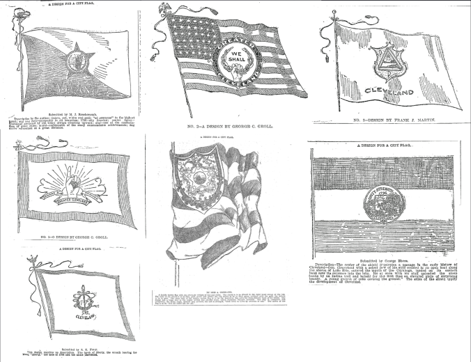
The winning design was submitted by Susie E. Hepburn from Columbus. The Plain Dealer describes the winning design as follows:
The flag consists of three stripes, red, white, and blue, of equal width,  extending across the flag vertically. The width of the white stripe and almost the height of the flag is the American shield. This is separated into two parts by the word “Cleveland” in blue or gold. In the upper left hand corner of the shield is the anvil with the hammer and wheel leaning against it, representing the manufacturing interests of the city. In the upper right hand corner is a capstan with an anchor and oars leaning against it to represent the marine interests of the city. These designs are in blue and bordered with the same color. The lower half of the shield is bordered in red and contains a wreath of laurel surrounding the date of the founding of the city, 1796. The colors of three stripes, red, white and blue, represent patriotism.[4]
Some of the arguments in favor of Hepburn’s design were that it was elegant, simple, and that it would be easily recognized as the flag of Cleveland and would not be confused with any other flag. The committee members also stated that the symbols on the flag could be recognized even while flying in the distance. (I disagree with all of these assessments, and will explain why shortly). The Hepburn flag was officially approved by Cleveland City Council on October 21, 1895, just in time for Cleveland’s centennial celebrations in 1896. The ordinance describing the flag included placing the words “Progress and Prosperity” at the bottom, however, that would not be added to the flag until the 1960s.
What makes a good flag?
No discussion of municipal flags would be complete without mentioning Roman Mars’s renowned TED talk: Why city flags may be the worst-designed thing you’ve never noticed. The talk centers around the Five Basic Principles of Flag Design, as determined by the North American Vexillological Association (the continent’s foremost experts in all things flag related). The five principles are:

Flag of the City of Cleveland
- Keep it simple
- Use meaningful symbolism
- Use 2-3 basic colors
- No lettering or seals
- Be distinctive or be related
Obviously, there is no “law” of flag design, and this could be a bit subjective, but I accept these principles as good guidelines for designing flags, or designing anything for that matter. So, how does Cleveland’s flag perform according to these principles? In 2004, the North American Vexillological Association conducted a poll to rate 150 US city flags and complied the results into an article called “The American City Flag Survey of 2004.” Cleveland’s flag was ranked 59th out of 150 and scored a 4.45 out of 10. I think that sounds about right. Our flag is by no means “awful,” but it also isn’t “great.” I think it fails to
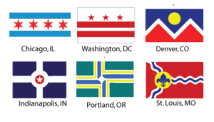
Examples of good city flag designs
uphold three of the five flag design principles. The crest at the center of the flag is not “simple” and it is hard to ascertain what the symbols are while looking at the flag flying from a distance. The flag has both lettering and a seal (although it’s not the seal of the city, but the flag’s crest has become the seal of Cleveland City Council). And finally, the flag is not distinctive. As mentioned before, most people seem to have no idea that the flag exists and when people see it, they often mistake it for the French Tricolor.
A new flag for Cleveland
When I lived in Washington, DC, I would see the city flag everywhere. It wasn’t uncommon to see people flying it on their front porch, or to see its design on souvenir items, or just in various restaurants and businesses throughout the city. The same thing is true in Chicago. Cleveland’s flag, on the other hand, is almost nowhere to be seen, except for city buildings, outside the City Club, at Progressive Field, and a few other places here and there. I’d venture to say that the Ohio City flag is more commonly seen in just that neighborhood than the Cleveland flag is throughout the entire city. The city flag should be something we can fly with pride and it should be a symbol we can rally behind. Right now, Cleveland’s symbols are primarily defined by our sports teams, visitors bureau, and t-shirt companies. A great city flag is a symbol that is not owned by anyone, that does not have a corporate trade mark, and can be used by all people of the city.
Unfortunately, I don’t believe that our current flag can ever achieve that, as its obscurity has persisted over 120 years. Take a look around Cleveland and try to see if you can notice it anywhere. Also, the designer of the flag wasn’t even a Clevelander, she was from

The symbols on the Cleveland flag (bottom right) are nearly impossible to make out when seen from a distance
Columbus. And her design was chosen not by the citizens of Cleveland, but by a committee of five people. Most of the symbolism on the flag does not represent Cleveland, except for the anvil & anchor and anchor & oars, and those symbols are not discernible when looking at the flag flying from a distance. The colors of the flag and the shield design in the center were created to represent American patriotism, not to represent Cleveland.
I think we can involve the whole city community to design a new flag that is more representative of who we are. I’m normally one for maintaining tradition and history, but not when tradition and history are not worth keeping. We’re always talking about Cleveland’s “renaissance,” so, what better way to usher in a new era than to create a great city banner that we can all fly with pride?
Sources:
[1] 4″A City Flag. It is Something That Cleveland Ought to Have. Julian Ralph’s Timely Suggestion,” Plain Dealer, April 25, 1895: 10, accessed January 08, 2017, http://infoweb.newsbank.com/resources/doc/nb/image/v2:122AFBBA107AC9E4@EANX-NB-125B8332433913E8@2413309-1259E74C563C4289@9-13166CD2E35F758E@A City Flag. It is Something That Cleveland Ought to Have. Julian Ralph’s Timely Suggestion?p=EANX-NB.
[2] “Cleveland’s Flag. Prominent Citizens Most Heartily Indorse the Idea Of Having an Emblem for the,” Plain Dealer, April 27, 1895: 10, accessed January 08, 2017, http://infoweb.newsbank.com/resources/doc/nb/image/v2:122AFBBA107AC9E4@EANX-NB-125B833844C717C5@2413311-1259E750D803DDCB@9-13151DB07A7C0C7A@Cleveland’s Flag. Prominent Citizens Most Heartily Indorse the Idea Of Having an Emblem for the?p=EANX-NB.
[3] “For A City Flag. The Plain Dealer’s Fifty Dollar Prizer for the Most Appropriate Design–Simple,” Plain Dealer, August 08, 1895: 10, accessed January 08, 2017, http://infoweb.newsbank.com/resources/doc/nb/image/v2:122AFBBA107AC9E4@EANX-NB-125B9277C1667534@2413414-1259E7C38D06A29F@9-1386394BF741F6EE@For A City Flag. The Plain Dealer’s Fifty Dollar Prizer for the Most Appropriate Design–Simple?p=EANX-NB.
[4] “The City Flag. The Design of Miss Susie Hepburn of Columbus Recommended. It Represents the,” Plain Dealer, October 19, 1895: 1, accessed January 08, 2017, http://infoweb.newsbank.com/resources/doc/nb/image/v2:122AFBBA107AC9E4@EANX-NB-125B36F4D089D52B@2413486-1259E80855612A84@0-138601C2E1A25940@The City Flag. The Design of Miss Susie Hepburn of Columbus Recommended. It Represents the?p=EANX-NB.
